ActGallery
From GersteinInfo
(Created page with '==Aggregation== The standard output for the aggregation script is a three column file corresponding to nucleotide position, bin number, and average signal (or a two column file c…')
Newer edit →
Revision as of 12:05, 9 June 2010
Aggregation
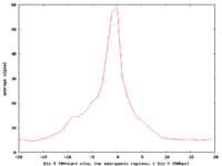
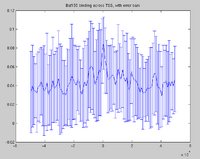
The standard output for the aggregation script is a three column file corresponding to nucleotide position, bin number, and average signal (or a two column file corresponding to bin number and average signal if bins are not uniform length). Options are available to add extra columns corresponding to standard deviation or quartiles in signal. Click here for a powerpoint introduction to the Aggregation tool. Several example plots made using the GSA (see below) can be found in the GSA source documentation bundle on the ACT website. We also have extensive examples of SNP density aggregation plots around various structural sites including TSS's, CNV's, and pseudogenes; and aggregation plots from modENCODE data showing histone binding around TSS's in various developmental stages of worm. These will be made public once the data is officially public.
- Web ACT
For aggregation, Web ACT generates a page with figures like the one shown here: example aggregation output
There is also the the Genomic Signal Aggregator (GSA, Zlab) which produces higher-resolution plots and works on a wide range of file types
Correlation
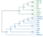
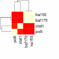
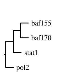
The main output of the correlation script is a text file containing the matrix of correlation coefficients between all signal track inputs. This can be viewed as a heatmap, or can be used as the basis of a phylogenetic tree based on a specified number of bootstraps.
- Web ACT
For correlation, Web ACT generates a page with figures like the one shown here: example correlation output
Saturation
Most of the examples for the saturation program have involved data from the modENCODE project which are not publicly available yet. The figures from these calculations will be available once the data is officially public. A powerpoint describing the saturation tool can be found here. The program creates pdf outputs which look like this:

